Over the years, we’ve seen the birth and death of several design patterns for graphical user interfaces.
Microsoft are seldom mentioned in the same space as great design. But after decades of strange menus and option dialogs something seems to stir at Redmond. Several images of the new user interface called “Ribbon” for Office 2007 have started to appear on blogs. It seems that Microsoft is moving away from the traditional pull-down menus of endless options, and instead grouping the options in tabs. Hopefully they will leave the annoying paper clip assistant out in the cold.
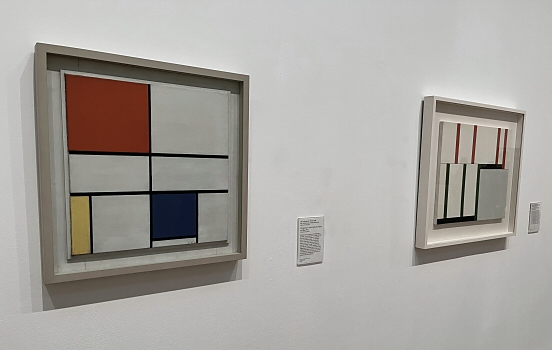 Minimalist makings at Tate Modern.
Compare this with the evolution of Google. They have an absolute focus on minimalism and that’s one of the reasons I started to prefer their search engine all those years ago. After a while their algorithms got better than the competition, but by that time I was already hooked on the clean interface. If I visit a search engine, it’s because I want to search for something. I don’t want to drown in the ads at AltaVista, I just need a search field to type my query.
“Making the simple complicated is commonplace; making the complicated simple, awesomely simple, that’s creativity.”
— Charles Mingus
Another interesting company in the same trend is 37signals. They move against the stream by adding less. This enable them to focus on the core and making it really good, instead of adding twenty mediocre features, just to keep up with the competitors software upgrades.
As further reading I would recommend the classic book Don’t Make Me Think by Steve Krug, which has been around for a while but still nails the essentials.
Related posts
Comments
No comments yet.
Leave a reply