Posts in category ”Web standards”
Found 15 hits, currently showing 1-10.
Brave new world of Web3
Web3 is mentioned everywhere these days, but what is it all about? 16 years ago I wrote about something called Web 3.0, but the vision shared by people back then was based on the recent emerge of Web 2.0.
A decade of responsive design
Time flies and suddenly ten years have passed since Ethan Marcotte coined the term “responsive design” in his classic article Responsive Web Design at A List Apart.

CSS Zen Garden reaches 10
As announced today by its creator Dave Shea, the CSS Zen Garden has reached the venerable age of ten years. When I first saw that site back in 2003, I was inspired by the possibilities of CSS.
RIP WaSP
When I started this site almost 20 years ago, the web was a completely different beast. Organizations such as the Web Standards Project (WaSP) were needed to bring order to chaos.
On vendor prefixes
There has been a lot of discussions lately in regard to vendor prefixes. It all began when some non-webkit browser representatives were considering support of the webkit prefix during a CSS Working Group meeting earlier this week.
The adaptation of responsive design
Apart from the HTML5 bandwagon, Responsive Design was arguably the most discussed topic of last year. The term was coined by Ethan Marcotte in his article from May 2010.

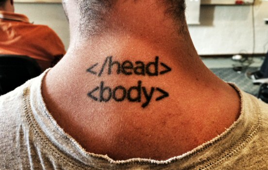
The value of semantics
Bruce Lawson is one of my favorite technical speakers, and it was great to see him at @media conference in London this summer. A few days ago he wrote HTML5 Semantics which gives a nice round-up of the state of semantics in November 2011.
Media queries and JavaScript
Mobile development and responsive design are frequently mentioned these days. The most widely used technique for responsive design is media queries, a CSS3 extension of the media types frequently used in HTML4 and CSS2.

Musings about Adobe Muse
Do you remember a thing called Dreamweaver? A decade ago it was a popular tool by Macromedia for building web sites, succeeding the infamous Microsoft Frontpage.
Embracing HTML5 and CSS3
The web is constantly changing and 2010 will be no different. Recently the Web Standards Project announced a change of direction, which really isn’t all that surprising. The “war for web standards”, as Aaron Gustafson calls it, is far from over.